RestAllergy: Restaurant Finder app for People with Allergies
A 6-month-long academic project that involves user research, ideation, visual design, and usability testing. The purpose is to provide a mobile app that helps people with food allergies eat comfortably when dining out.
My Role
Sole UX / UI Designer, Research,
Wireframing & Prototyping
Project Duration
~6 Months
Area of Focus
Restaurant, Food, Health, Location
Synopsis
This is a 6-month-long academic project that I did while learning from the Springboard UX Design online bootcamp. The primary objective of this project is to identify the issues that people with food allergies encounter and design a digital application based on the research to enhance their experiences.
If you want to jump ahead to view the ideations process or visual design, you can click on their respective links below, and it will take you straight to that process.
1. Background
2. Ideation
3. Prototyping
4. Usability Testing
Challenges & restrictions
These three restrictions below impacted my approach to solving the user experience.

Food allergies: Why I chose it
The reasons below are both from using personal experience and studies on food allergies in general.
Personal experience with food allergies
Personally have food allergies, and have experienced the hardships of eating out.
The population is increasing with food allergies
In the US, the number of people with food allergies has doubled.
Social anxiety and pressures
Miscommunication and social pressure of allergic reactions have caused anxiety.
Clear avoidance of eating out
In the UK, 60% of respondents have said they would avoid eating out altogether.
What do the users say?
After conducting...

User survey through Google Forms

User interviews through Zoom


These images were taken from my user research presentation

How might we provide people with food allergies the information and option to feel comfortable when eating out?
Figuring out the features
By looking at common features from competitors, and common steps that our users would take.
Let's explore ways we can improve Curtis' experience

Applicable for digital devices and apps.
In the square above are ideas that I generated that would fit the medium.
What are the common scenarios that Curtis would go through?

After seeing which common steps Curtis would go through:

This is what my design would do to improve Curtis' experience:


Laying out the designs
By looking at common features from competitors, and common steps that our users would take.
What do our users have to go through in order to access these features

Here is all the steps that the Curtis would go through with all the layouts:
After a quick test, what can be fixed first
Adding the option to add more allergens for sign-up
3/5 testers are worried that there aren't enough allergens on the list.
Access to different languages for the allergen card
Rating out of stars rather than numbers is better
4/5 testers prefer to have their ratings in stars rather than numbers, which decreases their time in ratings.
2/5 testers think that adding different languages allows the user to be able to communicate when they are going abroad.
Additional changes made
Allowing users to add more allergens.
So that no one gets locked out of the app due to not having their allergens in the app.
Added a button to allow users to adjust the language in the allergen card.
Replacing numbers rating with star ratings.
To keep the changes consistent after replacing the ratings.
Makes it easier for users to change their language on the fly.
Preparing the Hi-Fi prototype
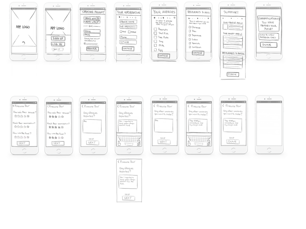
After applying the changes to the new flow, I prepped the wireframe for the prototype
This is what the flow chart ended up
Here's what the wireframe would look like without all the glamor


Now the Hi-Fi prototype for the testing:


Testing Prep:
The process below shows how I obtained user feedback for the product.
~10 testers
2 Usability test in total, users have similar background to Curtis
Online Zoom
Due to COVID-19 restrictions, all tests are conducted via Zoom.
Testing on Desktop
Since the test is on Zoom, I had the user test the product on their desktop screen.

Purpose of the test:
-
To see if the users can access all the features that I have in the prototype.
-
To see which paths need critical fixes and which need minor fixes
-
To see if the users would have a better experience with the features that I proposed.
-
To see whether the users would like to use it in the future.
Added Users with dietary restrictions to the list of testers
-
This was recommended by one of the testers, as they have similar wants and needs to users like Curtis.
-
Also, due to not having a lot of testers who fit Curtis's background.
What are the results?


What's next?

What I learned?
Social media groups can be helpful for user research
Without r/FoodAllergies I won't have a lot of user data to compile, let alone interview and test with.
Using UI design kits to speed up the design process
Adapting to remote testing during COVID-19
Due to restrictions, you can still get somewhat similar results even if it's done remotely.
Especially for my prototyping, where it cut my process time in half.
What can I improve on
Make quick decisions during user testing
Many times I could have adjusted my questions, especially when testers are wandering off the path.
Comments section should be populated
As a main feature that I want feedback, unfortunately many testers overlooked that.


