
Redesign of Landlord ratings site for College Off-Campus Housing
A 10 week long project that involves assisting an entrepreneur in developing the layout of his desktop website, with the goal of improve Syracuse University student's off campus housing experience.
My Role
Sole UX / UI Designer,
Wireframing & Prototyping
Project Duration
10 weeks
Area of Focus
University, Student, Off-campus Housing search
Synopsis
Initially named GradetheLandlord, the website seeks to help university off campus students figure out which landlord they can trust for housing rentals. I was brought on board to redesign, reorganize, and expand the desktop website according to the user research that was done by the company.
What was requested?
These request came from both the users and the client.
Change the overall design of the website
Client wants his site to go through a design overhaul, as its too outdated.
Figure out what to expand for the site
Client knows he needs more features but doesn't know where to add.
Challenges & restrictions
There are additional request that created restrictions to this project.
User reviews are primarily from surveys
Requested by the client, users submit reviews via survey and client moderates the ratings then post to the site.
Focus on local campuses region first
Client wants to start off local before going regional.
Primary device is desktop
Since the client foresees that the users would use desktop more than mobile.
Who are the users?
I took the data that the client has shared to me in order to create the users below:

Additional features that were mentioned by the users


How can we redesign GradetheLandlord's desktop website so that it provides its users the ability to search and review landlords and housing.
What are the competitors doing?
Did some analysis on websites that rate housing similar to GradetheLandlord.

Airbnb
-
Map to locate where the houses are
-
Shows amenities
-
Tenant ratings
-
Favorite places
-
Clean UI, mobile friendly

Trulia
-
Map to locate where the housing are
-
Unique contact property
-
Rent, sell, buy housing
-
Clean UI

Apartment Ratings
-
Tenant ratings
-
Landlords can reply to tenants
-
Has two separate pages for each listing
-
Clean UI

Zillow
-
Book appointments
-
Shows time of house listings
-
Map to locate where the houses are
-
Rent, sell and buy housing
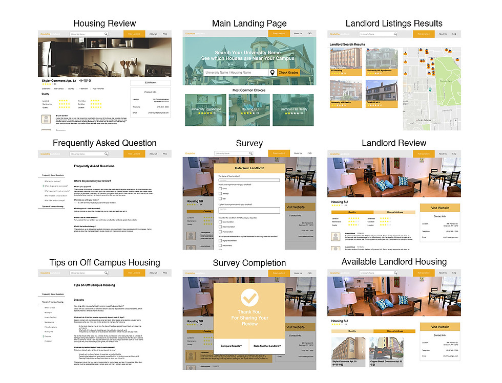
What features I ended up with
After looking at both the user needs and the competitors


Storyboard: What I want for the users to experience
I believe these features would help our users:

Here's how the features would go with different scenarios:

Let's build the first wireframe
After looking at both the user needs and the competitors
How the users would access each feature:

Quick wireframe of the main pages:

Quick let's test it out!
To see what I need to change in terms of user pathing and layout.
5 testers
Since I am in a college campus might as well use the students as testers.
In person testing
Best way to obtain feedback using paper prototyping.
Testing on paper prototype
No time to prepare on Sketch, I need feedback fast!
Specifics of the test:
-
Primary goal is to obtain feedback on tester's experience with the survey feature.
-
Secondary goal would be to see what their opinions are looking at the house listings.
-
In general to test if all the features are accessible to the user.

Result of the test:
Testers keep pressing the round shape images
Thinking that its a button, causing a lot of confusion as to where they should go.
Landing page, map and survey are easily accessed.
Testers cannot find where the housing page is.
This might be because the tester is confused how to get the housing page but not the landlord page.
So that the users can switch between specs rather than having to go and find each link.
What to change:
Avoid using shapes that can mean something else
Switching the circle images to square images might be a good idea.
Links to housing page is different than landlord page
So that users can easily distinguish the two links, creating less confusion.
Now let's test it with colors
To see what I need to change in terms of user pathing and layout.
Visual comps using GradetheLandlord's branded colors:
Conducting the test:
5 testers
Students with background in looking or have looked at off campus housing.
In-person testing
Easier to observe and record the testers using the prototype.
Testing on Desktop
To mimic how the actual user would be in if they were to use the website.

Specifics of the test:
-
To see if the previous complaints have been addressed.
-
To see how the testers would navigate through the prototype, now with images and color.
What do the final test say?

New changes, using new skills:
These changes was done after I left GradetheLandord, in an attempt to make the last adjustments from the previous test using the skills learned from the internship


New visual comps, now with adjusted colors:


