
VR Collaboration & Tools with Altitude XR
As part of Springboard's industry design project I was tasked to help a VR/AR startup company called Digitalogia ideate and design their Altitidue XR's desktop's Heads-up Display.
My Role
Remote UX / UI Designer,
Wireframing & Prototyping
Project Duration
1-month contract
Area of Focus
Virtual Reality, 3D, Collaboration, Industrial Interiors
Synopsis
Background
As part of a 4 week long Springboard project, I was put into a team to work as a UX design contractor for a company called Digitalogia. We mainly focused on designing the UI of Altitude XR's HUDs; from user and competitive analysis to ideation to high fidelity wireframes.
The Team
Our team consist of two designers, me included, and report directly to the CEO of Digitalogia.
-
Michael G (me) as UX Designer
-
Michael M as UX / UI Designer
Additional info of the client: Digitalogia
Digitalogia is a startup tech company that provides virtual reality services for construction, architecture, and energy clients. Their product Altitude XR is one of those services, designed to combine the client's work with online communication into one program.

Image taken from Digitalogia's website.
Challenges & Restrictions
Our team didn't have a lot of information to work largely stemming from the virtual reality industry and the information that was provided by the client.
No information on the users
We had to ask the client to provide us with user pain points and journeys.

Short time to provide final deliverables
Restricting our team to only be able to create a few features.

Limited access to demos
Limited amount of competitors that we can use to gauge what the industry standard is.
Asking CEO to provide user info
Most of the information below were provided by asking the CEO on what his target audience are, using it as a basis during the wireframing process.
How is the user, Derek Alden, adapting to remote work?

Slow to adapt to new technologies
Relatively new to using modern programs, prefers to not humiliate himself in front of young workers.
Prefers to take notes and do measurements reliably
Being an experienced work, he wants to reliably and accurately obtain information within a digital setting.
30+ years of experience in construction industry
Relatively new to using modern programs, prefers to not humiliate himself in front of young workers.
Too much paperwork to sift through during meetings
A problem that is exacerbated through remote work, is getting the right information for the meeting.
Had to take additional steps when working remotely
Had to take multiple steps to complete his tasks, such as adding meetings etc.
A map of what Derek's experience is:

Recreation of what the user's journey looked like.

How can we design Altitude XR's Heads-up Display so that it allows its user to be able to accurately conduct and collaborate their work online.
What are competitors doing?
Only able to try out 1 out of the 3, had to observe others using videos on their site.


Matterport
Allows users to reliably measure objects inside of the house and take notes in the space.
Cannot move freely, only at specific points in the interior.


Cavrnus
Old fashion design similar to AutoCAD programs.
Fully integrated meeting in a 3D space, while able to roam freely in the space.


vGIS
X-ray type vision, allows users to see what is hidden under the floor or walls.
Mobile / tablet first design, very modular and simple to use.
What features to pursue?
Based off what we see from competitors, we prioritize these features below:

How would these features look in a flow?

The user flow that you see above are used for both measurement and navigation features.
What is our UI going to look like?
Most of the information below were provided by asking the CEO on what his target audience are, using it as a basis during the wireframing process.

The design that we ended with:

We ended up presenting to Digitalogia the design that see below because it allowed for easier access to the tools if the HUD is at the bottom. In addition, the design looks modern yet professional in order to appear to both older and younger users. We also felt that this design is much easier to implement on different devices especially in virtual reality.
Lets create all the steps for for each feature
After giving the green light by Digitalogia for our design, we started constructing the low fidelity wireframes in Figma. We also made some additional adjustments to the design such as placing all the UI elements on the borders of the screen in order to maximize the space which the user can see the 3D environment. This was also the time where we decided which features we should showcase their web flows.
Collaboration Tool


Navigation Tool (Rooms & Toggles)


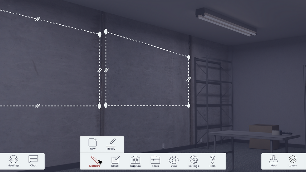
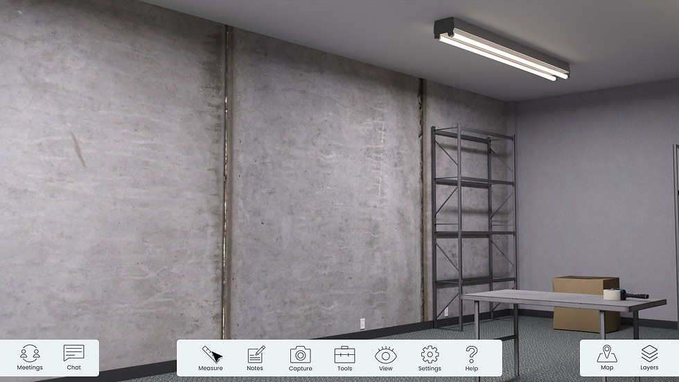
Measurement Tool

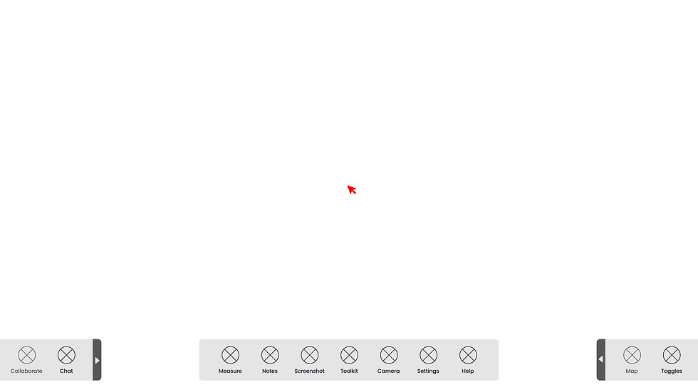

Note Taking Tool


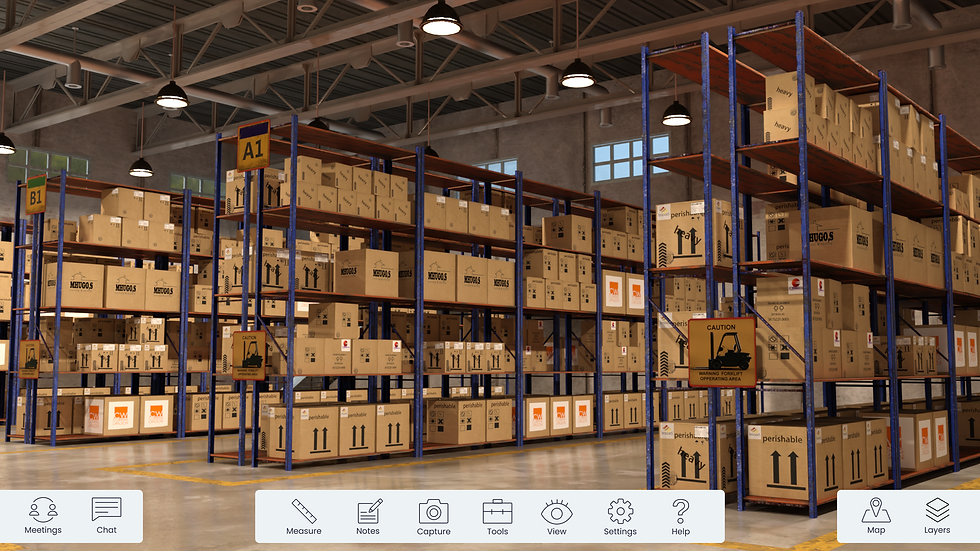
What does our designs look with color?
What does our designs look with color?
Style guide to make work more efficient and easier
All of the visuals were based on Digitalogia's branding. In addition, the colors were chosen specifically because its contrast enough so that they can stand out from each other, both in light and dark mode. For the icons we went for a simplistic and minimalist style, so that it doesn't clutter up the HUD especially when its around 1.5 pixels large.


Screenshot taken from our Figma artboards.
Same steps but imagine if the user is using it
Collaboration Tool


Navigation Tool (Rooms & Toggles)

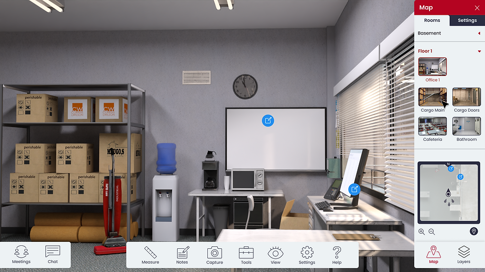

Measurement Tool

Note Taking Tool


What did I learn?
Using proto-personas to create the product
When there is no documentation of the users best to ask the CEO whom the users are.
Adapting under a tight deadline
Planning and knowing what methods to use at specific time has helped me work under pressure.
What can I improve moving forward?
Plan out the user flows before wireframing
To avoid useless features or steps, best to have the flow iron out than to be force the scrap the entire work.
Explore similar projects?


